Pancake House redesigns stores, updates logo

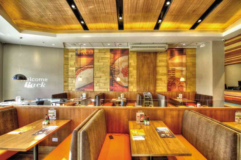
PANCAKE House’s Capitol Commons branch features wood accents, plush furniture and warm lighting. CONTRIBUTED PHOTO
Pancake House is set to redesign all its stores with traditional Filipino features that will remind diners of home.
The restaurant chain, which was recently acquired by Max’s Group Inc., will apply the new concept to 15 existing stores that are set for renovation and 15 new branches that will be constructed this year, said Max’s executive director and chief marketing officer Jim T. Fuentebella.
“Pancake House remains a household name with a loyal following. But with the highly competitive market it is facing, we decided we needed to do something to bring it back to the forefront of its dining category,” Fuentebella said.
“This meant retracing the brand to the heritage that made it one of the country’s favorite dining traditions,” he added.
The new look of the restaurant, featuring wood accents, plush furniture and warm lighting, can now be seen in its branches in Lipa City, Batangas and Estancia, Capitol Commons, Pasig City.
Fuentebella said he got the design inspiration from the dimensions of the Pancake House branch in Lipa City.
“The long and narrow façade reminded me of a shed, and the first three words that came to mind were shack (functionality), shelter (comfort), and shed (accessibility),” he said, “If you look at the things those words are associated with, they are actually the same things that used to describe Pancake House.”
The restaurant’s logo was also overhauled and now shows a new interpretation of its famed house symbol that complements its old orange background.
But Fuentebella said Max’s had stayed true to Pancake House’s family roots and heritage, as its offerings are still based on the recipes that allowed it to win the loyalty of customers through the years.
Max’s has also retained the brand’s complementing colors—fuchsia, brown and blue—in the stores’ walls, chairs, counter area and placemats.
“These were the colors chosen by the original owners of Pancake House because for them, they showed the spirit of the 1970s,” Fuentebella said. “This is really us going back to the core.”