Prospective clients view model units, end up buying
Design professionals outdo each other in coming up with interiors of model units that would be best appreciated by unit owners or would influence prospective buyers to purchase condo units.
The two model units designed by architects Nap and Mae Cruz at the Entrata Tower 1 (Soho tower) are expected to give buyers of Soho (Small office home office) ideas on how to design and furnish their units, said Harriet Joan Ducepec, vice president and Business Development head for Entrata.
According to Ducepec, the model units also make them appreciate even better the versatility and flexibility of use the Soho units provide.
“And especially now that our units are ready for occupancy, which are right at the site, will also give our prospective buyers a feel of their future office or home,” she said.
Ducepec revealed that clients, who get to visit and view the actual units at the site, are so impressed and end up buying the units.
Article continues after this advertisement‘Organic Interlock’
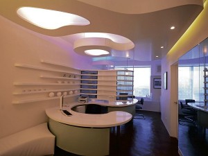
Article continues after this advertisementThe husband and wife team (of cruz&michelena-cruz) designed a pure office unit, measuring 33.61 square meters, which they named “Organic Interlock.”
Sensuous lines in a white on white color scheme was how they described this model unit. According to them, they used this color scheme (or referred to as noncolor scheme) because it lends a pristine effect. For some sparkle, the room is dotted by dabs of gray, black and silver, creating an almost ethereal experience. The sense of naturalness, they said, somehow gives rise to a soothing, calming effect on the inner being.
After the blessing of the unit by Fr. Gerald Macariña, Mae explained the design to the guests: “The organic forms meander through the room in gentle curvilinear shapes. The desks engage the ceiling patterns in interlocking fashion, like positive and negative. Similar to the dynamic balance of the yin and yang, the desks (closer to the earth and therefore the yin) relates harmoniously with the ceiling pieces (closer to heavevn and therefore the yang).”
According to her, the couch has a soft undulating shape. The desks, she said, have modesty panels, shelves and a room divider that follow equally graceful lines though rendered on the vertical plane. The use of perforated screen provides some visual privacy of the executive and the two guests in the inner room. She likewise mentioned a slot for an indoor plant. She pointed to a niche where the cabinet and shelves for files and a pantry are tucked.
‘The Chameleon’
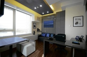
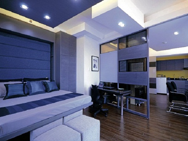
The home office model unit, measuring 49.89 sq m, can be be shifted from an office by day to a home by night. It was dubbed “The Chameleon” by the designers due to the animal’s ability to change color. The effortless conversion of the unit’s interiors from office mode to home can be likened to the chameleon’s color change.
Designed for a video production outfit, the unit has colors influenced by the intense hues of the chameleon. The artwork and accessories display soft, impeccable transitions between the greens and the blues, according to the designers.
Mae said the day starts with an office mode: a receptionist desk; two staff desks; a big mural on the wall that reveals a water dispenser and a coffeemaker; an inner room separated by sliding screens; an executive desk and a conference table with two chairs; a sofa and a wall-mounted TV for viewing the video produced by the office; and a small closet containing the executive’s clothes.

DESIGNED for a video production outfit, the unit has colors influenced by the intense hues of the chameleon.
According to Mae, these transformations happen at this workplace after office hours:
• The reception desk is converted into a wine bar, which has a sliding compartment that displays wine bottles and goblets.
• The staff desk becomes a dining table after hiding all the papers and laptops with a cover.
• The mural on the wall slides away to reveal a full kitchen complete with a refrigerator, a cooktop and a sink.
• The sliding partition slides open to give a better view of the room.
• The main portion of the executive desk pivots to a position along the partition, thereby freeing up space.
• The conference table folds up and disappears into the wall.
• The back panel on the sofa flips down to reveal the bed.
At home mode, one can relax and enjoy the rest of the night by way of creature comforts. When tomorrow comes, the home is transformed anew into an office.
The newest landmark in Filinvest City, Alabang, is the Entrata Urban Complex. Two of its four towers have been built. These are the Soho tower, which is now ready for occupancy, and the Crimson Hotel, which is expected to open next month. The other two towers are for future development.

