Putting culture into design

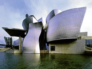
FRANK Gehry’s Walt Disney Concert Hall in LA, and his Guggenheim Museum in Bilbao, Spain—undeniably beautiful structures—are similarly designed and are contextually interchangeable. They are generic and could in fact be built anywhere else in the world.
In a world that has become so global, where do we find our identity? I was amused during an elevator ride yesterday: two call agents speaking in distinct, exaggerated, American accents. Yes, we Filipinos speak with an American-English accent rather than a British-English accent, but theirs sounded like they grew up in, like you know, um, Los Angeles.
Design, like language, has a distinct way of defining identity. It grows from context and develops in individuals certain characteristics that become exclusive to their kind. All that has ever been designed has expressed aesthetics from its context: geography, history, climate and people. In essence, the aesthetics of our communities is defined by our culture.
Successful
The marketing concept of “branding” has been so successful because it capitalizes on the perception that “you are what you have been designed to look like,” using powerful visual characteristics as a media for expressing the essence of things. But in the modern world where boundaries have blurred and technology has made time zones negligible, you have become, pretty much, just like everyone else in the world.
Global cultural overlaps have created a crisis of character, for how does one embrace the workings of international design concepts, materials and technologies, without getting lost in its mass identification? Structures and environments are permanent installations that cater to the collective and define the population for whom it is built. The attempt to modernize sometimes abandons identity although there are truly many ways to interject culture and context with international design flavor.
Take for example Santiago Calatrava’s La Ciudad de Las Artes y Las Ciencias which may appear to be a generic avant garde creation at first glance, but which upon closer look, has apparently employed the organic art nouveau structures and detailing that spread in Catalonia after Gaudi introduced and developed it in Barcelona.
Interchangeable
On the other hand, Frank Gehry’s Walt Disney Concert Hall in LA, and his Guggenheim Museum in Bilbao, Spain—both undeniably beautiful structures—are similarly designed and are contextually interchangeable with neither one truly expressive of the American dream, nor of the Basque ancestry. They are generic and could in fact be built anywhere else in the world.
But modern international design is not the only one with the identity crisis. Traditionalists sometimes have a displaced sense of history as well, with period designs expressed in places where they had no historical connection or no contextual relationship. Instead of showcasing what is locally bred and cultivated, it showcases the culture of an alien ideal or a neighbor.
Take for example some local residential condominium buildings that attempt to look like neo-classic monuments, with details that have absolutely no bearing on our history nor nationality, and seeking only to look fancy and aristocratic but failing miserably because not only they are out of context, but also their architects never understood that period’s design language in the first place. The buildings are simply ugly. Really, what were they thinking?
Very generic approach
Which reminds me of the decency of architect IM Pei when he designed the much misunderstood pyramidal structure in the center of the Plaza of the Palais du Louvre in Paris, opting for a generic and modern pyramidal structure whose materials and simple geometry so graciously complemented the intricate details of the existing historical structures. It did not compete with the Louvre; it instead enhanced it through a very generic approach.
In Metro Manila, our design aesthetic seems to be intruded upon by soot, wire-mangled electrical posts, odd-looking “modern” street lamps, billboards and dirty, generic looking buildings devoid of any flair or character. Must poverty always be an excuse? Or is that the identity we want? I still get a thrill over that “banig” as the Philippine map on the “It’s More Fun in the Philippines” logo. So visibly Pinoy! And when I drive through Roxas Boulevard, I wish all the art deco buildings would be rehabilitated and made new, just like they were when first built in the 1930s. And let’s not talk about the one on Taft Avenue we lost not too long ago.
Those two call agents in the elevator are part of the young population reaping the benefits of years of economic freedom and growth that are propelling the building industry in the country today. I’m hoping that at the very least, the new buildings pursue a generic aesthetic; but the ideal would be or them to have a contextual and historical approach to modern design. This is, after all, our Philippines.
Contact the author through designdimensions@abi.ph or through our Asuncion Berenguer Facebook account.