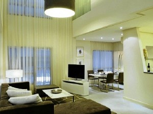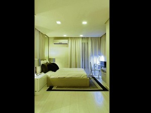
REPEATED colors, simple lines and a consistent background color palette unify the lower floor of the living and dining spaces with the second floor bedroom.
“Chopsuey” is a term we commonly use for visually chaotic and incoherent spaces or environments. The term of course, refers to one of our favorite comfort foods: the Filipino dish of Chinese origin, made up of an assortment of chopped meats and vegetables, tossed and cooked quickly, with flavors held together by a starch thickened sauce. Like the dish, “chopsuey” environments appear to have been quickly put together in a medley of elements that don’t seem to be in unity. Missing, it seems, is the unifying starch-thickened sauce.
Design is an assembly of countless elements that have to come together through many different organizing systems. It is difficult to set ground rules; design is fluid and can never be boxed into a craft kit. It is when rules are broken that creativity manifests.
There are a few guiding principles on creating the unifying palette from where creativity can flow from. Below are a few tips on keeping the framework of your design work—and its environments—together:
1Organize movement paths so that spaces flow from one to the other. Nothing annoys me more than moving through spaces hindered by strangely located walls or furniture pieces that hamper movement and make you feel confronted and unwelcome. One should be able to move with ease from one space to the next, with visual vantage points creating points of interest and establishing a visual path for movement.
2Work with clusters. Especially in large spaces, a few clusters or groupings—furniture settings with their furnishing, artwork and lighting—work better than trying to spread one large cluster just to work with the scale of an area. While areas have a general scale, consider the human scale and the human being that is more comfortable in more intimate, rather than in large, alienating, spaces.
3Pick out a color and use it throughout. Color schemes may vary per area but there should be an overriding color that pulls everything together. One dominant background color wash or even accent color, can be used throughout various spaces to create visual harmony.

5Match key pieces with minor pieces. While matching furnishing pieces can be boring, having each element standing alone in its uniqueness can be very chaotic. Try matching larger pieces—a coffee table, for example—with a minor piece like an occasional table. Don’t match a dining table with the buffet, but rather, with a smaller accent display shelf. One of my peeves is having everything matching, looking like the whole setting was bought off a catalogue or a shop’s vignette display, with no creative inputs on mixing and matching.
6Keep light temperatures consistent. Light “temperature” refers to the color of lighting: a bluish cool tone, a neutral daylight, or a warm yellow. Some variation in light temperature is acceptable especially for functional task lighting, but for larger spaces and overall lighting, they should carry the mood throughout one area and into the next. Light temperature can change the perception of the depth of space, the hues of colors and the sharpness of light. In other words, it can completely change a visual experience.
7Give it character. This is the stamp of the occupant, the brand of the company, or the personality of the facility. While a design may be pleasant to look at, its character defines the kind of environment that it is. When the character flows consistently through related spaces, it speaks loudly of the designer’s philosophy or the occupant’s personality. It makes the spaces unique.
Contact the author through designdimensions@abi.ph or through our Asuncion Berenguer Facebook account.

