The real 2022 color of the year is green!
Pantone may have declared otherwise, but the real 2022 Color of the Year is green!
Vert in French; verde in Spanish and Italian; grun in German; virere, ver and viridis in Latin, meaning to grow, to spring and to be green. It doesn’t surprise me that many color trendsetters have chosen this hue to signify the coming year’s possibilities—that of recovery, progress and evolution.
Green has been more recently associated with sustainability and environmental movements, but months in and out of lockdowns have made us appreciate our intrinsic leaning toward this color. We don’t even have to go into the “plantita/plantito” phenomenon.
Experiencing greens in forest bathing and in nature immersions as being therapeutic and restorative have made us recognize its healing properties. It’s no wonder that we would like to take its various shades and colors into our spaces.
This color is finally having its moment, coming to the fore with an assortment of hues— some leaning to warm shades with red or yellow overtones, and others leaning toward the cooler turquoise hues.
Though not entirely available locally, paint companies around the world have showcased their chosen palette of greens in different shades and tones.
The world of green is a wide expanse that leaves you to do the experimentation. Enjoy them in 2022!
Sherwin Williams’ “Evergreen Fog” is a grey-toned, desaturated version of a sage green, which many years ago would have been taken as a more industrial color, but nowadays is looked upon as a tone that is replete in a collected calm. It is earthy, elegant and soothing. Paired with brighter tans and neutrals, or golden timber tones, this green is soft and refreshing.
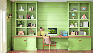
“Blanched Thyme” is Valspar Paints’ green for 2022. “A cool, organic green that works beautifully with warmer wood tones for a natural and balanced look.” Looking somewhat like an avocado green, this shade is a little more casual, vibrant and happy. It gives you a forest-bathing feel as its liveliness mimics the greens in the woods, albeit in lighter tones.
“Calming and nourishing—this natural shade encourages a calm balance within yourself and within your home.”
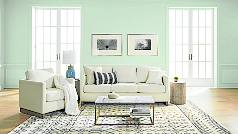
An almost minty teal green, “Breezeway” is a cool, bright and cheerful tone. It is possibly one of the most uplifting greens. Paired with creams and whites, the experience is airy and ethereal. It also reminds me of sea glass and glacial ice.
“A new year brings the opportunity to embrace a sense of renewal and pursue untapped passions,” said Erika Woelfel, vice president of color and creative services at Behr Paint Company. “Whether it’s lacing up our hiking boots, or breaking out the gardening tools, Breezeway inspires us to fully embrace the hobbies or adventures, both near and far, that excite us. We look forward to a color that welcomes a hopeful sense of renewal, restoration and healing.”
Another shade of sage, Dulux’s “Olive Sprig” is a warmer shade of green, leaning towards some yellow overtones and reminiscent of the more pleasant mossy greens. It is more formal and elegant but not necessarily confined to the more mature design settings.
Combined with complimentary hues like pink or blush tones, the formality breaks into a younger and more playful look. Because of its earthier grey cast, this shade of green works best with whites, neutrals and deep wood tones.


