Why Classic Blue just isn’t for 2020
Classic Blue is beautiful, but too ordinary and too familiar. —PHOTO COURTESY OF DOORSAN.CO.UK
As the year 2020 walked through the door, turn-of-the-year discussions focused on whether we were actually leaving or entering a new decade. This was important to know because the beginning of 10 years defines yet another goal to be reached at the end of the milestone. How well have we lived our lives? If we made our New Year’s resolutions, what resolutions would a full decade’s turn merit? How large of an impact can we make in 10 years?
Late last year, color expert Pantone announced its color of the year for 2020: the “Pantone 19-4052 Classic Blue.”
Pantone describes it as a color “instilling calm, confidence, and connection” —further stating that “this enduring blue hue highlights our desire for dependable and stable foundations on which to build as we cross the threshold into a new era.”
For those not familiar, Pantone is a color-matching system established in the early 1960s. It creates color guides for different industries and has grown to be the world leader in color-matching systems, its palette serving as the standard to a slew of products for which perfect color- matching is essential.
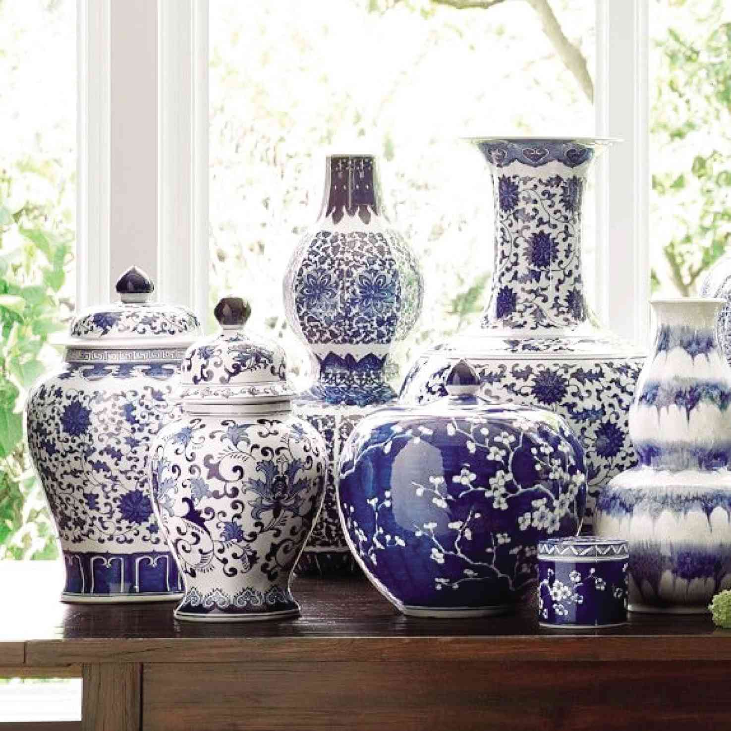
Porcelain vases in familiar blue and white tones.
The “Classic Blue,” declared Pantone, “is imprinted in our psyches as a restful color. It brings a sense of peace and tranquility to the human spirit, offering refuge, aiding concentration and bringing laser-like clarity. Classic Blue re-centers our thoughts. A reflective blue tone, it fosters resilience.” It sounds like a blue everyone will appreciate having in their already colorful lives, but is this really what we need?
In 2017, the color of the year was “Greenery”—Pantone’s response to the globally expanding awareness of environmental issues, urban stress and the need to connect with nature.
“A refreshing and revitalizing shade, symbolic of new beginnings. The more submerged people are in modern life, the greater their innate craving to immerse themselves in the physical beauty and inherent unity of the natural world. This shift is reflected by the proliferation of all things expressive of Greenery in daily lives through urban planning, architecture, lifestyle and design choices globally.”
In 2018, the Color of the Year was a rebellious and unconventional “Ultra-Violet.”
It “communicates originality, ingenuity and visionary thinking that points us toward the future… symbolic of counterculture, unconventionality, and artistic brilliance. Musical icons Prince, David Bowie and Jimi Hendrix brought shades of Ultra Violet to the forefront of western pop culture as personal expressions of individuality.

Pantone declares that he 2020 Color of the Year, PANTONE 19-4052 Classic Blue, “is imprinted in our psyches as a restful color, it brings a sense of peace and tranquility to the human spirit, offering refuge. Aiding concentration and bringing laser like clarity. Classic Blue re-centers our thoughts. A reflective blue tone, it fosters resilience.”
It symbolizes experimentation and non-conformity, spurring individuals to imagine their unique mark on the world, and push boundaries through creative outlets.” In the age of social media, homogenized societies and globalization, Pantone jumped into the bandwagon of individualization.
And in 2019 was “Living Coral”—“a color that embraces us with warmth and nourishment to provide comfort and buoyancy in our continually shifting environment. In reaction to the onslaught of digital technology and social media increasingly embedding into daily life, we are seeking authentic and immersive experiences that enable connection and intimacy. Symbolizing our innate need for optimism and joyful pursuits, it embodies our desire for playful expression.”
“Living Coral” is a warm, happy light color, perhaps in reaction to unfavorable political situations around the world during the preceding year, and the insightful reflection of looking within to search for solutions to loneliness and disconnect.
As I write this, the year 2020 had just walked through the door, the bushfires in Australia continue to burn, and a renewed unrest in the Middle East has just started with Iran retaliating and bombing the American barracks in Iraq. If this is any indication of the challenges we’d be facing this year, can we truly appreciate Classic Blue?
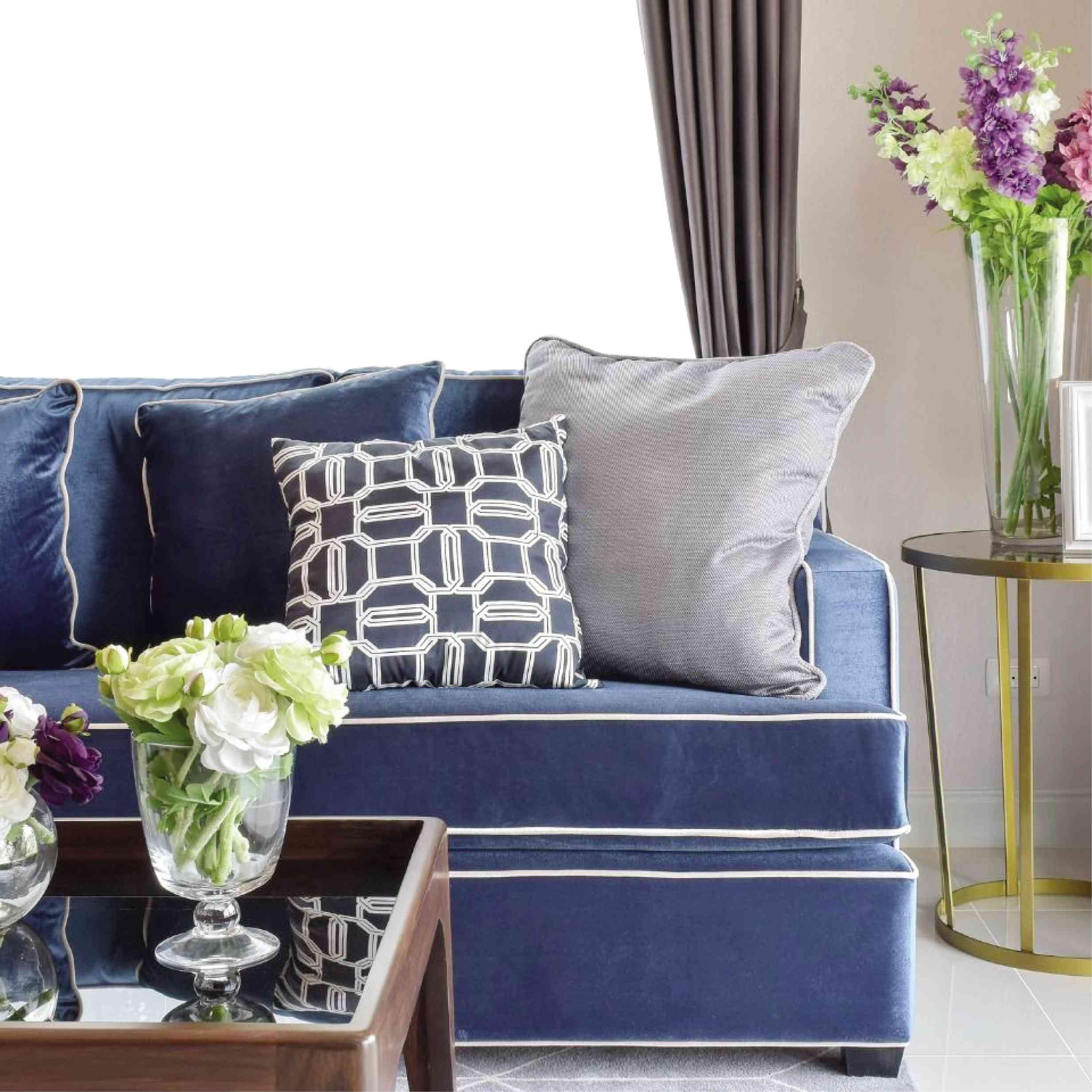
The hue of blue has always been about dependability, trust, loyalty and integrity.
It is no wonder that most banks and financial institutions have found comfort in blue as their corporate color. It is also the hue of peace and serenity, of tranquility and calm, clarity and intelligence. It is also mystical: the deep blue sea, the twilight sky or a blue moon. It can also be aloof, cold, snobbish, aristocratic and “blue-blooded.” It is always rigid and orderly, like the uniformed soldiers and policemen who wear their dark blue uniforms, or as a standard light blue in hospital scrub suits.
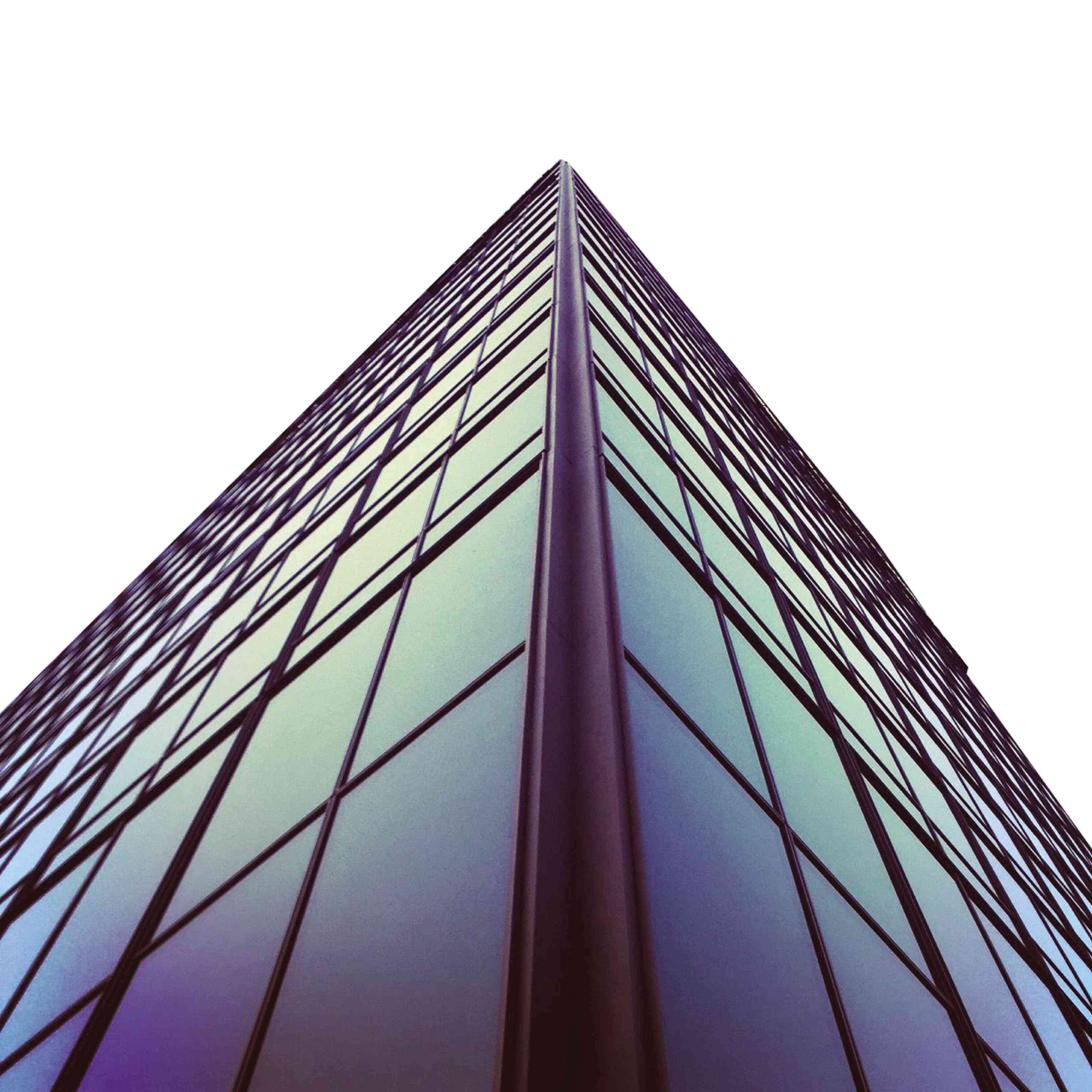
Blue reflective glass remains a favorite for exteriors, blending into the sky, giving least resistance to the palette of a skyline. —PHOTO COURTESY OF PLASNNDESIGN.COM
While the color blue is utterly familiar and comforting, I’m not sure it defines the qualities the world needs for 2020. I feel that 2020 needs more agility, more energy, and more clarity to plough through the issues that trouble the world—the overuse of resources; climate change; over-population; pollution; inequality, depression, loneliness and the lack of well-being; food security; and the lack of economic balance and equal opportunities.
If we are going to muster the energy to conquer all these, Classic Blue just doesn’t carry enough momentum.
Pantone has declared the need for constancy and confidence, trust, faith and reliability. And while these words sound honorable and true, Classic Blue, if it were a person, strikes me as someone embattled, yet inert, inflexible and fixed in its ways.
Looking at the color itself, Classic Blue is not only boring, it is too bland, too standard and delivering more gloom in its stability. We need a flaming yellow. Or perhaps a glowing orange like that of sunrise? Or a whitish yellow like that of a spark? Or even a red-orange hue that screams out the urgency needed to solve all our pressing problems, a colored call to action. While Classic Blue is dependable, it is too static, too fixed onto its foundations, and sits tranquil in its own refuge like a man who cowers and won’t face his problems—a solid resilience with no action.
If we going to find ourselves in a better place at the end of the new era, then we need our foundations to be shattered and re-built with a new mindset and refreshed energies.
What can we achieve in the next 10 years? Now, Pantone, please roll out those powerful, passionate, and sweltering hues instead. We have work to do.