The Pantone palette and its color of the year

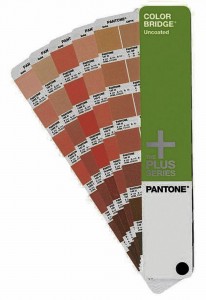
PANTONE’S fan palette of colors are identified with their own codes, and with their equivalent CMYK mixture for ease of digital printing. color palette courtesy of Pantone
IN 1963, Lawrence Herbert founded Pantone in the United Kingdom. Originally a company that developed color cards for the cosmetics industry, Herbert reengineered it into a full (and the first!) color matching system provider in the world.
For those not familiar, what Pantone developed is essentially a “color communication” system now widely used and appreciated by people in the advertising, print, fashion, digital art, interiors and the building material industries. You see, these are the trades where color matching is critical to the success of a product, and the process of reproducing a color from design through to its production is subject to failure in accuracy, mainly due to the lack of a common language in transmitting the actual hue, shade, brightness and depth of a certain color.
In the world of design, systems like Pantone allow concepts and ideas on color to be identified, matched and transmitted accurately and consistently. The multitude of tones that can be derived from the hues in the color wheel—primary and secondary colors like blue, red, yellow, orange green and violet—are blended with each other, and with blacks and whites, to develop into literally millions of colors. While blends and mixtures in other media are easy to quantify (take for instance the ingredients that make up your favorite cocktail, or the numbers that add up to a mathematical equation) colors are a more complicated bunch.
The reality is that colors are being reproduced through a very wide variety of equipment that have not been calibrated with each other and will produce many different tones and shades from what should have been just one. The red from one printer, for example, may not be the same red produced by another.
Premixed paint
Article continues after this advertisementEven the process of mixing the most basic crème or taupe paint color for a room becomes complicated and confusing when the first batch runs out and another batch has to be mixed. Fortunately, more and more paint companies are producing premixed paint, and keep adding on new mixes, all documented in a “fan” with the specifications corresponding to an actual color swatch. Their version of a color communication system for their brand alone.
Article continues after this advertisementEvery year, Pantone goes through past color palettes and does research through interviews with people in the creative industry, and forecasts the popular colors for the coming season or year. For 2012 they had “tangerine tango” which seemed to have picked up quite early, most especially in the fashion industry, but not in mine. In 2011 they had “honeysuckle” which was very popular abroad but not here. 2010’s turquoise was a big hit in the interior design trade, especially with soft furnishing.
Pantone’s forecast of favorites for 2013 is a palette of both bright and earthy spring colors like poppy red, nectarine, monaco blue, tender shoots, lemon zest, linen, african violet, grayed jade and dusk blue. From names alone, you can take a wild guess at what they look like. A vivid and verdant emerald green stands out as the “Color of the Year.”
Leatrice Eiseman, executive director of the Pantone Color Institute, says that “Green is the most abundant hue in nature—the human eye sees more green than any other color in the spectrum. Symbolically, emerald brings a sense of clarity, renewal and rejuvenation, which is so important in today’s complex world. This powerful and universally appealing tone translates easily to both fashion and home interiors.”
A jewel tone
Emerald green is considered a jewel tone and therefore blends with deep reds, purples and blues. It also matches elegantly with golds and coppers, and its association with the precious stone gives it perceived luxury and sophistication. With silvers, it becomes a cooler, fresher and younger palette.
It would be interesting to note that Pantone and its standardized colors propel many industries into the successful sale of their products. As such, Pantone continues to develop color matching systems in specialized fields. It has a CMYK guide for this 4-color print process; a graphic arts guide for Metallics, Pastels and Neons; it developed its Fashion+Home Color System, using colored paper and fabric for directly assembling color or swatch boards. It also produces the Pantone Paints palette with Europe’s Fine Paints company for perfect matching with Pantone colors.
While a “Color of the Year” may sound trivial to some, this annual choice has driven desire, created jobs and produced millions of dollars. Thanks to Pantone, the color-related industries are alive, well, and thriving—accurately and consistently.
Contact the author through [email protected] or through our Asuncion Berenguer Facebook account.