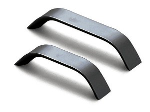
THE IMPACT of small elements in design is underestimated. Small hardware items, for example, are usually small but a poor selection can ruin what could otherwise be a good-looking piece of furniture.
A few days ago I visited Divisoria with my daughter who signed up for a “fashion boot camp,” and had to buy small embellishments for her outfit. Her needs were specific—half inch square pyramidal metal studs in a bronze finish with spikes that go through the fabric for fixing.
We scoured fabric accessory shops in the metro but hit a dead end. So half a day into my regular workday, we braved the afternoon heat and the crowd to look for those studs. After searching for two hours, we so happily found them, and managed to leave Divisoria just in time to evade a late afternoon downpour!
But the travel was worth it. Her project—the studded magenta skirt and crème top look fantastic. Perfect studs. God is indeed in the details. A silver stud would have been too cold a color, and the larger studs we first saw would definitely outsize the skirt and look completely wrong in proportion.
Attention to details
In my own everyday design “boot camp,” many people don’t see or appreciate the little things that matter. A simple mirror in a minimalist bathroom—for example: frameless and seemingly floating from the wall surface—commands attention to detail for its proper installation:
• The backing must not be visible.
• The wall must be plumb so there can be no “cheating” with the levels.
• Any shadow will run in a consistent width along the edges.
• The sealant must be applied to be concealed from the front or the sides.
Tall order in small things, but such is the effort to get things right.
So you can imagine the effort in designing something like a TV wall unit: What will the bottom gliders be? What do they look like? In what finish? And what design and finish for the drawer handles? And the drawer hardware installed at the side—should it instead be a concealed glider mounted at the bottom? And how about the shelves—if they are glass, will they sit on stainless steel pegs? In a satin or polished finished?
Details, details, details. All these little things, when properly put together, can make that TV wall unit look grand, but one wrong piece, and the whole thing can go terrible wrong.
Wrong choice
I remember when I used to walk through the furniture strip in Hong Kong where Italian-made items were sold in shops near those selling pieces made in China and Malaysia. Some of the non-Italian pieces didn’t look bad. I remember thinking I had found the bedside tables I was looking for, but was disappointed when, upon closer scrutiny, I saw it had the wrong choice of handles. That totally gave it away, and made it look “cheap.”
This issue is also inherent to many lighting fixtures like a pendant lamp with a great shade, nicely finished edges, but the screw that fixes it to the ceiling looks oddly sized, and makes the lamp lose its elegance altogether.
Best option
Or the closet system that had the seemingly perfect provisions for the hardware and finishes: slender trouser hangers, beautifully anodized hang bars, hardware that moved with ease, and a select choice of high-pressure laminate panels for the doors with edgings that disappointingly did match perfectly in color. The best option was a lone clean aluminum edge—an added detail or element—that saved the door panel’s aesthetics.
Little things do matter, and they matter a lot! Whether items are being designed or being bought off the shelf, pay attention to the minute details that can make or break their looks, and sometimes even their functionality. Design, color, finish and proportions have to come together in unison to achieve correct aesthetics. Oftentimes, wrong details can be corrected by replacement, or if caught soon enough, by a reassessment of its design components.
While design work can look deceivingly simple, never underestimate the effort needed in ensuring that the various elements are accurate in intent, and are complementary of each other. Such was that skirt. And going through the extra mile and braving Divisoria was definitely worth it!
Contact the author through designdimensions@abi.ph or through our Asuncion Berenguer Facebook account.

