With design and manufacturing forever evolving and producing new resources for design, creative experimentations will never cease, and that’s what I love most about technology—it makes design concepts possible in the real world. And a new year signals a better world—even for design. Here’s to 2012!
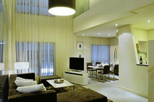
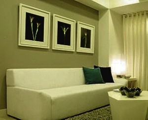
Neutral palletes. Grays remain strong this year, with their hues going either cool with bluish overtones, or warm with beige overtones. Gunmetal grays and “greiges” [the term coined for the (grey) gray-beige mixes] are used with various shades of white to create a clean and neutral palette. Absolute neutral grays of black and white fade out, as these have neither character nor personality. Off-whites will continue to flourish with hints of muted color from practically any hue on the color wheel.
Bold tertiary colors. Mixed from primary and secondary colors, tertiary colors are the new favorite accent tones as they throw a punch with their strong, saturated hues. Yellow-orange, red-orange (Pantone’s color for 2012, Tangerine Tango is essentially a red-orange), red-violet (plums and purples), blue-violet, blue-green (turquoise; aqua) and yellow green (apple green)—are used as accents to predominantly neutral background palettes. You can use them as your sofa throw pillows, or to accentuate one wall of a room, or on the artwork hung on your wall, or as smatterings of color throughout your accessories.
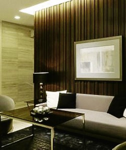
Textural applications. Same material, different application. Tile, wood, stone and many other finishes are used more imaginatively through some variation in the way they are cut, installed and finished. Wood is installed using different species (a trend that was probably sparked by the use of old or reclaimed timber) allowing the natural grains and colors to create visual texture; tiles and stone slabs are cut in different sizes and installed in varying depths. Even glass and fabrics are not spared, as they can be glued and laminated to create what, from a distance, could appear to be a different material altogether.
Lustrous surfaces. In sharp contrast to heavily textured surfaces, other materials are applied to complement and create contrast. Turning completely the other way, pearlized, metallic, gloss and satin finishes are used in lieu of plain matte finishes, with their transparency, sheen and luster imparting a certain softness and luxury to the ruggedness of heavily textured surfaces.

Natural materials. With healthier “green” concepts all over our consciousness, natural materials such as paper, linen fiber, wood, bamboo and most especially those that are untreated or produced and used in their most natural state will flourish. Aside from their naturalness of being a component of healthy living, their innate characteristics left unprocessed also means less use of precious energy. Hand-woven linens and cottons, unfinished wood and unpolished stone will be seen working with synthetic and man-made elements to create some very rustic yet modern environments.
I’m liking 2012 already!
Contact the author through designdimensions@abi.ph or through our Asuncion Berenguer Facebook account.

