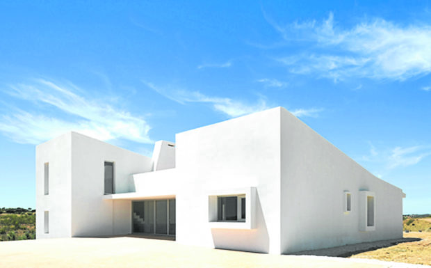
Photographing architecture
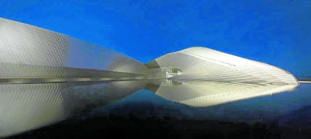
The surfaces of the aquarium (The Blue Planet in Denmark) are artificially lit, enhancing its rhythmic and textural architectural qualities while maintaining the definition of its outline against the blue skies of twilight.— adam mork/arcaid images via businessinsider.com
I have yet to meet someone who doesn’t enjoy and appreciate architecture.
During travels, and even more so when overseas, the diversity of design invites us to click, click, click away at the uniqueness of all the new structures we encounter and experience. With handy and sophisticated smartphones, it isn’t difficult to capture the beauty of the built environment and freeze them into images we can look back to with delight.
While DSLR cameras are technically more advanced and are still the desired gadgets for professional photography, today’s smartphones have camera features that allow us to select depth of field and exposure, providing high quality images without the complications of a professional camera.
So, how does one photograph architecture? First and foremost, with an eye that looks out for dynamic volumes, arresting lines, symmetry, textural planes, rhythm, and extraordinary light. A remarkable structure can be made even more extraordinary when captured from a particular angle or vantage point during a specific time of day. Here are some insights to capturing that frame.
Firstly, decide on your focal point. There is always that subject of interest, that element that drew your eyes to look in the first place. This could be a design feature, a burst of light, texture or color, or an overall compelling element of a structure.
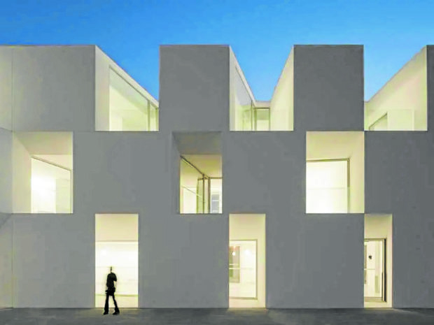
Most architectural structures need human figures integrated into their capture to define their scale.—Fernando Guerra/Arcaid Images via businessinsider.com
Follow the classical “rule of thirds” in composing the frame. Your smartphone has the feature to show this grid on its screen. Here, the image frame is sectioned into thirds horizontally and vertically where you can locate the focal subject on either the right or left one-third of the composition. This positioning will naturally capture and draw the viewer’s eyes toward the focal point and works exceptionally well for subjects that are asymmetrical.
For symmetrical structures, a balanced composition is the most effective—a one-point perspective, so to speak. If the foreground is of design significance, like a beautifully patterned floor, play around with the height of the camera to fill the frame with as much of the foreground, in which case your focal point can be one-third from the top of your frame, or one-third from the bottom if the preference is to lessen the floor and emphasize the upper features.

While it’s delightful to view structures in their entirety, details that aren’t obvious from afar can be fascinating up close. Here, pre-cast baffles that function as a ‘brise soleil’ for this museum, create texture, and break the expansive wall area while serving to diffuse the light transmitted to the inside.
If you have the flexibility of time, take photos during the time of day that best enhances the design features of the building. For example, structures with interlocking volumes or heavy texturing are best photographed against strong lighting—around 11 a.m. to 2 p.m. Sharp lighting creates highlights and shadows that define these volumes and textures.
Structures with glazing are best photographed at sundown when the sky’s colors can add an unusual character to the structure, with the colors of sunset reflecting on its skin.
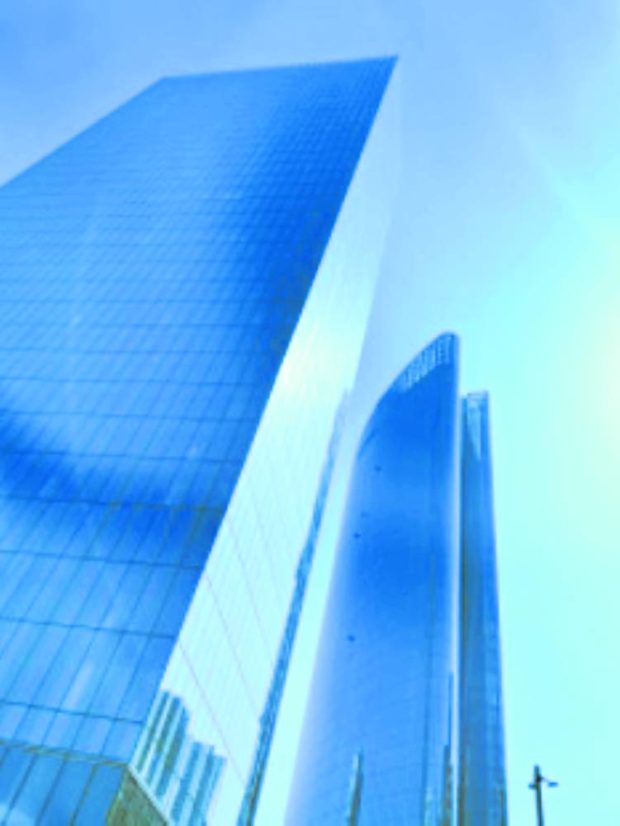
These glazed structures picked up the strong blues of the sky. Here is my own capture of Makati’s Zuellig Building and One Ayala, as I drove at two in the afternoon to grab some coffee.
Alternatively, when photographed in the middle of the day, glass reflects the strong blue of the sky. The outcome is stately and elegant. Early morning or late-in-the-day twilight or “blue hour” moments are the best for capturing buildings with extraordinary lighting design. The deep blue skies allow for a building outline to still be appreciated while its other planes are enhanced by artificial lighting. The result is a tranquil and dramatic capture.
When photographing a structure without people, its scale and size can be vague. Including people in the distant background of your frame will provide scale to the structure and relate it to human activity, making it visually measurable. It also makes the image more relatable. Avoid positioning people in the foreground of the frame as it can be quite distracting.
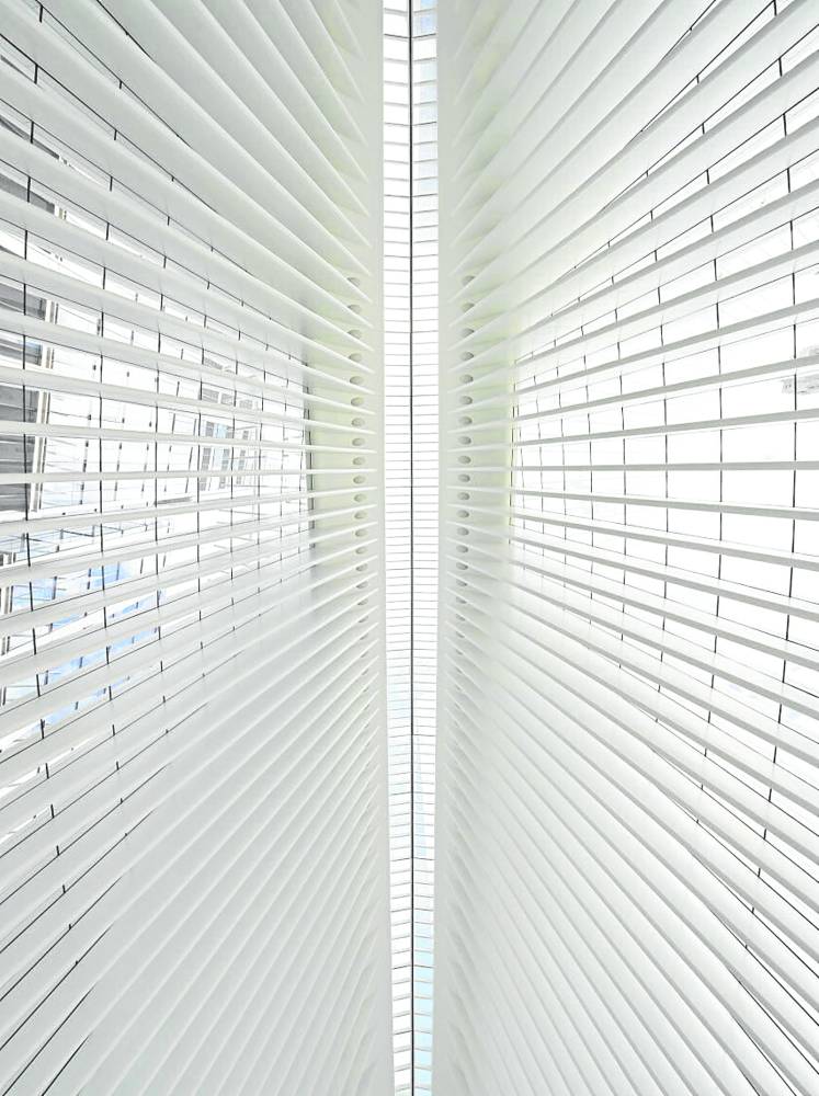
The symmetry of the high ceilings of The Oculus in New York is captured in perfect balance from the ground level perspective. —dezeen.com
Zoom in to showcase details and to give emphasis to the features which, from a distance, appear to be texture, but up close are the interesting attributes of the architecture. Here is where you will understand how scale in design come into play, where a design feature can provide a different experience depending on the distance from which it is viewed.
The true enjoyment of capturing photos is not in the end-product image that can be kept forever. Much more than that, it is in the experience of framing and composing architecture—those moments when a photographer understands a structure’s story, deconstruct its narrative, and discover its relationship to the humans for whom it is built to serve.
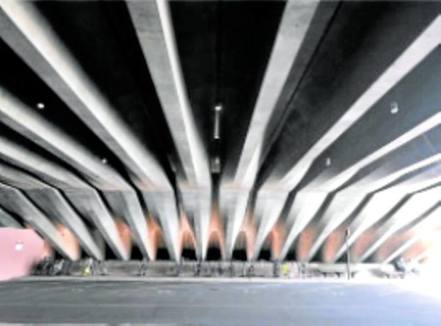
This capture of a less-seen area of the Sydney Opera House observes the rule of thirds. Since the ceilings are interesting, it frames the focal point at the lower third of the image, giving the larger two-thirds above as the space to which one can appreciate a splaying ceiling pattern.
Architecture is best experienced before that moment when it is clicked and frozen in time.
Ar. Isabel Berenguer Asuncion is a practicing architect and one of the two principal architects at Asuncion-Berenguer Inc., an architectural design and interior architectural design practice. @isabelbasuncion

