“This place is weird, but it’s so weird and nice in an awesome way!” —said my eight-year-old daughter while looking up to the ceilings of Antonio Gaudi’s nearly completed basilica, the Sagrada Familia in Barcelona.
Like this young child, you need not fully understand design to be immersed in the delight of something so visually powerful and emotionally uplifting. Whether it was the volume of space or the unique forms and textures, this basilica had undoubtedly triggered my little girl’s emotions.
But many do not see the greater, hidden aspects of this notable work of art.
Well thought out process
Behind the inspiring void, the colors of the stained glass, and the organic facets and textures, are the many hours of hard thinking by Gaudi, pushing his pencils to ensure that the varied elements in his mind could be assembled into an impressionable whole. The hyperbolic and helicoidal forms, the vaulted ceilings and the multifaceted walls, have come together in perfect play.
The Sagrada Familia experience is not easy to come by. This was a work of pure genius, but you need not be within such a magnificent structure to appreciate the results of a well thought-out design process.
Many other spaces can evoke awe and delight as well.
While large structures aim to establish themselves as part of the community, smaller spaces provide for very human-scaled interactions with the immediate surrounding.
The experience is spatial, visual, and even tactile.
Strong sense of place
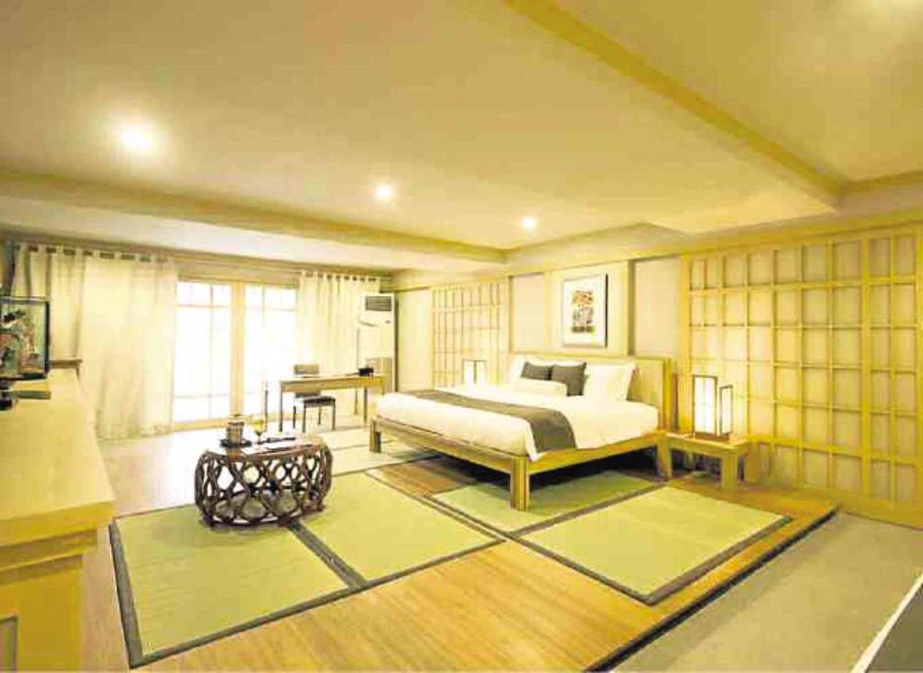
Sitting in a hotel room, do you find moving around to be fluid and bump free? Does your chair upholstery feel soft, smooth and luxurious? Do you see a column sticking out of the wall? Well, likely not, for someone who spent a substantial amount of time trying to conceal this structural component and keep it from protruding so oddly.
Sitting in a restaurant, is the air conditioning cool enough? Is the lighting comfortable to your eyes? Does your thigh graze the underside of the table, hampering you from crossing your legs or repositioning freely? Are you able to walk to your table without weaving through tightly positioned chairs and saying “excuse me” to everyone you pass?
These are the things considered when approaching a design problem.
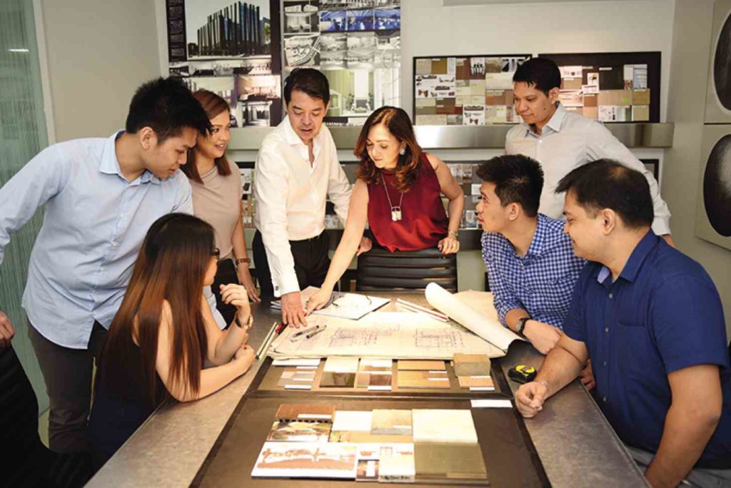
You see, most people look at design as a simple practice of putting things together. They fail to realize that creating an environment requires composing a variety of elements and assembling them so that the end-user has a rich experience and a strong sense of place.
While other professions would have their to-do lists in a linear format, architects and designers conceptualize in a radial manner—three-dimensional, organic, and yes, very visual.
Mind map
Think of it as a mind map exploded into a three-dimensional space of images rather than words. Your design professionals envision the end-product and the positive emotions they want to evoke through their design even without putting anything down on paper just yet.
Their visions go beyond colors and materials, and begin with a properly laid out plan that sets the foundations for the complicated process of compressing this mind map into a cohesive, functional and aesthetically pleasing whole.
As layouts are being conceptualized, so are the elements that will make the spaces function optimally.
These are the utility systems like electrical and lighting, air-conditioning and exhaust systems, sanitary and drainage, water supply and fire safety. They are given even more importance in spaces like restaurants, hospitals, theaters or other facilities where technical support is essential to the experience it needs to deliver.
Design approaches are then checked against government regulations: zonal requirements and restrictions, building code restrictions, laws pertaining to sustainable practices and environmental protection compliance, and provisions for persons with disability.
For other project types, elements go through more stringent ratings: wind load capacities for curtain walls and windows; moisture-resistance for ceiling boards; fire-retardance and abrasion resistance for fabrics; anti-slip ratings for flooring materials; color rendering or temperature indices for lighting; and the list goes on.
Human dimensions
Then there is the aspect of ergonomics, wherein body dimensions are used as measure for its interaction with the design elements. Consult western books, and you will end up with dimensions that cater to the average non-Asian size.
Those few centimeters, however, can impact your ease and comfort.
Ever sat on a chair with a seat that was a bit too high, your legs would dangle? Or washed your face in a lavatory counter that rose to nearly the height of your chest? Or reached for a doorknob that felt strangely a little too high for what is deemed comfortable for your normal grip?
Fortunately these would probably just have happened in places where the general population was taller and larger.
For most part, local practices have adjusted to the typical Filipino scale and unless your design professional was careless or a novice, you can be assured that a few centimeters were mulled over to capture just the right distance or height because, yes, it matters.
The same human dimensions are used for the sequencing and arrangement of movement, and in carving spaces and compartmentalizing activities into an interactive whole.
After function and flow are established, other components are formed around it: ceilings, walls and partitions, surface treatments, furniture, furnishings, and lighting design.
Completing the design
As a design professional, this is admittedly the most enjoyable part of the service: selecting materials and elements and figuring out the details so that everything comes together seamlessly.
It is only after this, that construction plans are painstakingly organized, illustrating with much care how all the design elements must be constructed and executed.
It is also here where all the different trades—like the utility systems spoken of earlier—are coordinated in order to operate as a functional whole.
Without a properly drawn set of fully coordinated documents, a design cannot be properly built.
Antonio Gaudi never completed the designs for the Sagrada Familia, and the architects that took over the task of completing the project continuously tap onto his vision.
If you have the chance to visit, head down to the basilica’s museum where the design and engineering studio is replicated.
Without this room and its processes, the Sagrada would remain undone, and Gaudi’s vision of a visually powerful and emotionally uplifting temple would have not come to fruition.
The author is the principal architect and designer at Asuncion Berenguer Inc.


