Design concepts
A good design adds value to any development as it enhances and customizes personal and social spaces.
A thoughtful design sets the style that projects the preferences, personality, and lifestyle of prospective buyers.
At the start of any project, the designer ascertains the client’s project needs.
These include space requirements for his daily activities, work, interests, hobbies, and preferences; budget, which refers to how much he is willing to spend for both hard costs (architectural, engineering design, fit-out) and soft costs or IDFFE (interior design, furniture/fixture/equipment—furniture, fabrics, accent lighting, beddings, window treatments, artworks and artifacts); and schedule of project completion.
Form follows function
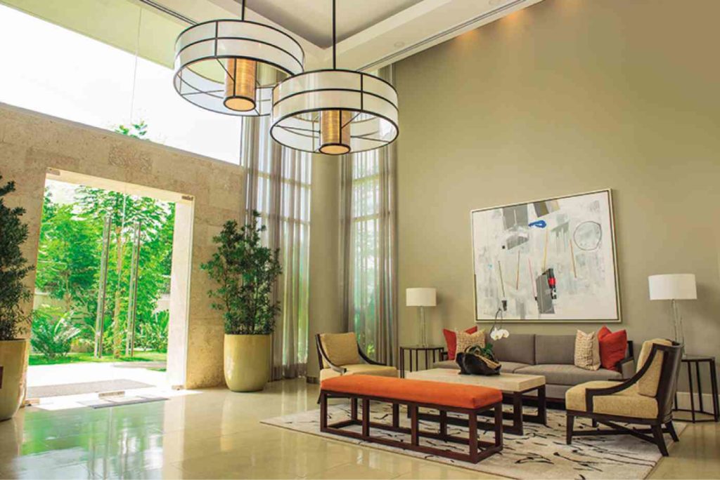
In designing huge spaces, apply the design principle of “form follows function.” The space should satisfy the client’s needs and requirements. Try to create attractive vignettes of social spaces to allow for varied group activities.
Here are other tips that you can take note of when designing your space:
1 Do establish the preferred style, color schemes, finishes and then apply theother elements and principles of design (line, texture, form, balance, repetition, contrast) to create unique spaces that will complement the client’s personality.
2 Do create a focal point of interest that will attract attention, be it an artwork, carpet, accent chandelier, a unique accent detail, or even a floral or leafy table centerpiece. These can transform a room from boring to cozy and interesting.
3 Do emphasize space by creating a neutral shell, then adding accent colored walls and keeping window treatments like draperies, sheer, blinds in the same light complementing colors. Space is precious and expensive so avoid overcrowding the room with unnecessary furnishings and accessories.
4 Do use larger artifacts like vases, pots, accessories. But keep them to a minimum. An eclectic mix of artifacts and collections can be highlighted and accessorized further with a vase of flowers or greens.
5 Do create ambiance with efficient and effective use of lighting, color, and texture.
6 Do proportion sofas, chaises, accent chairs and tables to the vast space. Cute and petite furniture will appear even smaller unless used as accent pieces—like stools as side tables, a chair at a corner vignette.
7 Do use large artworks to “color” and create style and ambiance. 8 Do use large accent pillows on well-proportioned sofas—20”x20” or larger of soft, plump pillows with the accent colors and prints will create a luxurious feel within the large space.
9 Do create balance and cozy ambiance in an eclectic style by mixing antique pieces with more contemporary soft furnishings (sofas, lounge chairs, ottomans).
10 Do not use too many details, textures, prints within the same space—these are distracting.
11 Do not put all furniture against the walls. Center some of them or allow some space between the walls and furniture to create an even larger illusion of space. Vignettes or separate furnishing arrangements in a large space are more attractive and functional.
12 Avoid shocking or bold colors on walls. Limit these to selected accent walls, or use colorful artworks, accent pillows to create focus with your neutral palette.
13 Do not display all your artifacts on tabletops or consoles (put some away) to make display more attractive. Create groupings of decor/artifacts that you can rotate to make spaces feel different and special every time you change.
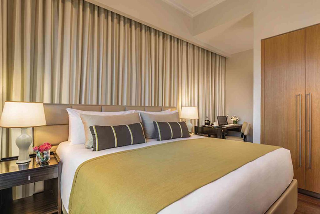
14 Do not overdress windows and side doors. Frame them well with neutral and flowing curtains to soften and highlight.
15 Avoid harsh accent lighting over sitting rooms. Soft, ambient lighting is more appropriate. Chandeliers, droplights make dining rooms feel special.
In designing small spaces. . . A huge, luxurious space requires more attention in terms of planning, detailing, and accessorizing. It tends to accommodate more users so vignettes have to be created to allow efficient use of the whole space.
Designing small condo units meanwhile is more personal and interesting.
A good design satisfies the user’s space requirements—entertaining, relaxing, dining, cooking, sleeping, bathing, working—while keeping clutter away in well-thought of storage cabinets, drawers, shelves.
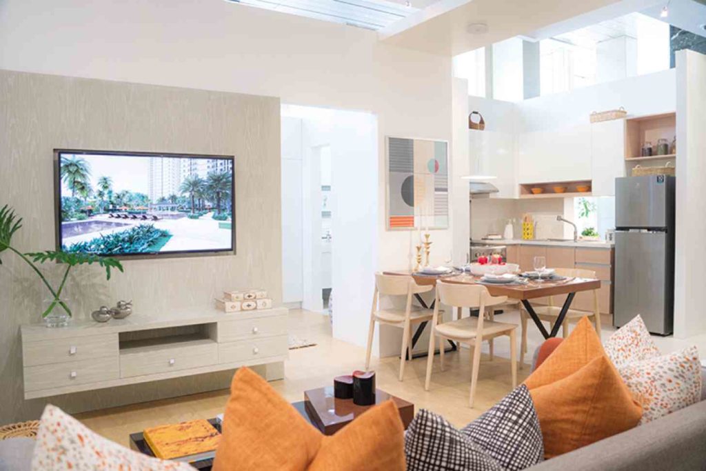
For example, if you have a 42 sqm nook that you’d like to dress up, here are some suggestions to keep in mind:
1 Select furniture that is not only stylish but functional as well. Example: a sofa that doubles up as a guest bed or dining banquette; a dining table that also functions as a study or work table (and so a droplight or a work light and an electrical outlet adjacent to the table are needed); a side table that can serve as a tray table for dining or writing; or an entertainment cabinet that has ample cabinets and drawers for living, dining, or working stuff.
2 Furniture should be well proportioned. Careful measurement and space planning are a must for small spaces to accommodate all intended activities while preserving that valuable circulation space. An inch or two makes a big difference while designing and laying out furniture pieces in small spaces.
3 Define a style that complements the client’s personality and preferences—be it modern, tropical-warm Asian, cool coastal, Scandinavian, or American. It has to be a style that will blend with and highlight his favorite artifacts or collections.
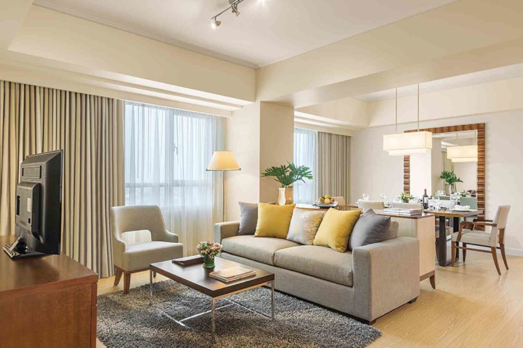
4 Select color schemes that will create an illusion of bigger space. Make the basic shell (walls, floor, ceiling) in neutral colors like whites, beiges, light grays, greige (grey-beige). Any accent colors like yellows, reds, orange, teal, greens, black, darker grays, lilac, or blush will work with the basic colors. Final colors should be the client’s favorite.
5 Design storage cabinets against walls in neutral colors to mimic wall colors so as to blend instead of stand out. This way, the sense of space is not lost.
6 Use design tricks like mirrored walls to double the space; horizontal stripes to widen the look; and vertical stripes to create the feeling of height.
7 Achieve a cozy ambiance through the use of soft and accent directional lighting; soft, plump throw pillows with a theme color and patterns; floral arrangement; and well-selected personal artifacts, books, candles and artworks that reflect the client’s taste. Select artworks that will add color or pattern on an otherwise plain wall. Add a throw on the sofa—a beautiful accessory that is both decorative and relaxing.
8 Lastly, unify furniture and achieve that comfortable, cozy look with area rugs—shags, kilims, woven—as these add that final luxurious touch for a well-decorated 42 sqm flat. The author is the principal architect of Erfe & Associates.


