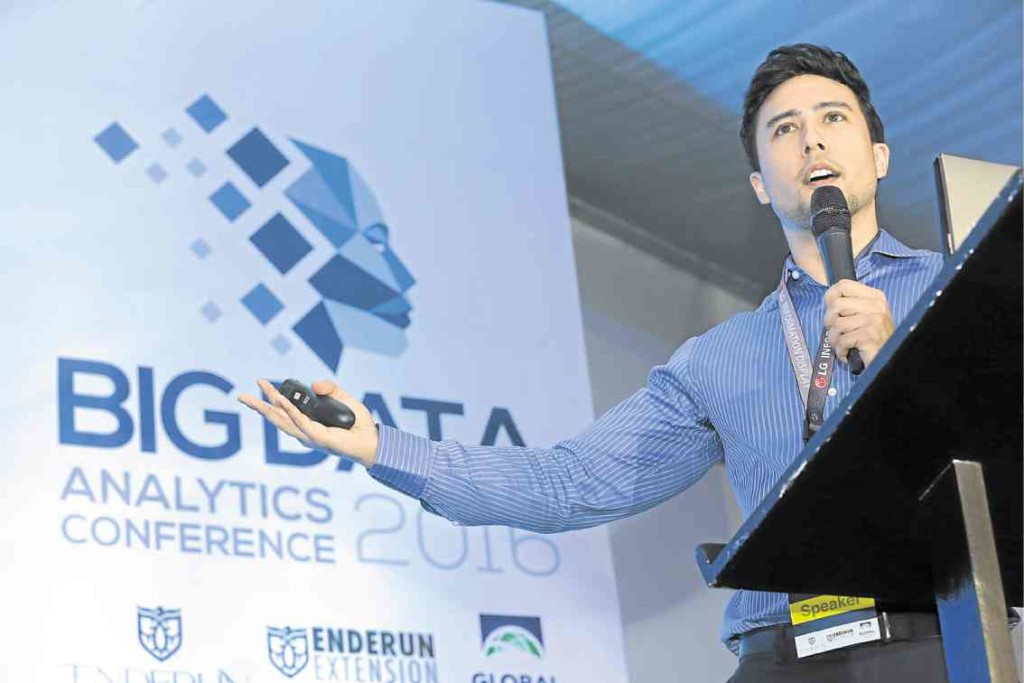
“I think this is a great chart,” says Isaac Reyes as he examines the slide on the projector screen.
He’s conducting a seminar called Data Storytelling for Business, or how to tell engaging stories with dry and dreary data, and one of the workshop participants has come up with a chart showing the number of customer care calls from clients of a telecommunications company in Canada.
Reyes tells participants how to present data to a company’s decision makers in a coherent and appealing way. Teasing out meaningful insights out of a heap of data is challenging enough, but it doesn’t end there. You present these insights in a way that makes an impact and facilitates effective decision making.
In a way you combine your logical and creative faculties to create something useful for businesses, or any other organization, or people who could use the insights from raw data.
Reyes, data scientist and lead trainer at DataSeer, obtained a bachelor’s degree in actuarial science from Macquarie University in Sydney and his Master in Statistics from the Australian National University.
He says he “lives and breathes” data and likes to “explore the intersection of data science with human behavior.”
His company, DataSeer, provides analytics training and digital analytics for companies and professionals with an interest in data.
“Any company that needs to make decisions with data needs data storytelling skills,” says Isaac. “We’ve seen great benefits to companies we’ve trained in banking, telcos, FMCG (fast-moving consumer goods), and BPOs (business process outsourcing companies). There is also potential for the Philippines to act as a global center for outsourced ‘data storytelling’ work, i.e., companies around the world sending their raw datasets and slide decks to the Philippines to then be converted into cohesive, compelling data stories.”
He also believes that improving data science and analytics literacy can help us deal with economic and technological forces bearing on the call center or BPO industry, which employs over a million Filipinos and contributes over $22 billion in revenues a year.
“Over one million call center workers in the Philippines are going to be out of a job within the next 10 years due to automation and AI (artificial intelligence). The country needs more balikbayans to come back and establish companies in areas that are higher up the professional services value chain, such as analytics. This will help skill up the nation in services that are ‘future proof’,” he explains.
Reyes has a personal reason to make this happen, perhaps because he is a descendant of Jose Rizal. Last year, he was profiled by CNN Philippines about his ancestor’s greatest achievements, the importance of paying tribute to heroes, and what a true modern hero is.
“I consider all of us to be descendants of Rizal,” he says.
Reyes, together with some partners from Australia, set up DataSeer here in the Philippines. It has offices in Australia, Singapore, and the United States, and the company trains people from all over the world. Reyes usually spends two weeks here in the Philippines and two weeks elsewhere in the world to train people.
“Data Storytelling is my favorite course to teach because it makes such a large impact in the professional lives of the people who take the course. We spend years in formal education learning how to tell stories using spoken and written language. However, we are never formally trained in how to tell stories using numbers and graphs,” says Reyes.
He teaches his students exploratory data analysis and the importance of visualizing data. He discusses the Gestalt principles, which deals with human perception of various stimuli. People perceive lines and shapes differently. Color also plays an important role in creating intelligently captivating graphs. He equips students with various visualization tools such as the histogram, bar chart, scatter plot, line chart, area chart, waterfall chart, bubble chart, and the pie chart.
Reyes has noticed that in the Philippines, there’s a tendency to “get it all on one slide” when telling data stories.
“I’ve observed a culture of managers wanting absolutely every data point on a chart labelled. Both of these pressures result in cluttered data stories that aren’t immediately readable. Professionals here can improve their data stories by using more white space, being selective with labels, and using multiple slides to ‘stage’ their data stories,” he says.
He has many anecdotes about participants who successfully used what they learned from the data storytelling course.
“We had one call center client engage us to help their managers tell better stories about trends in the quality of their call handling. The head office for the client was based in the US. After the US execs saw how much the data stories had improved, they wanted the Philippine office to set up a team of dedicated Excel and PowerPoint ‘ninjas’ who would be responsible for improving the quality of the company’s PowerPoint decks and dashboards. Our training resulted in this shared service center adding a brand new service line to their scope of responsibility,” he says.
Having more of these “ninjas” around would certainly be a boon to businesses in the country. And it may even contribute to a strategic shift in focus from our call centers.
That’s surely a data story worth telling. —CONTRIBUTED
