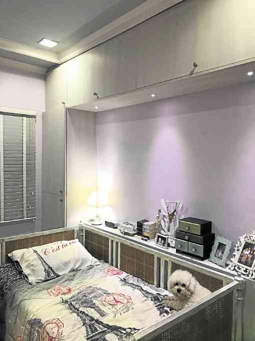
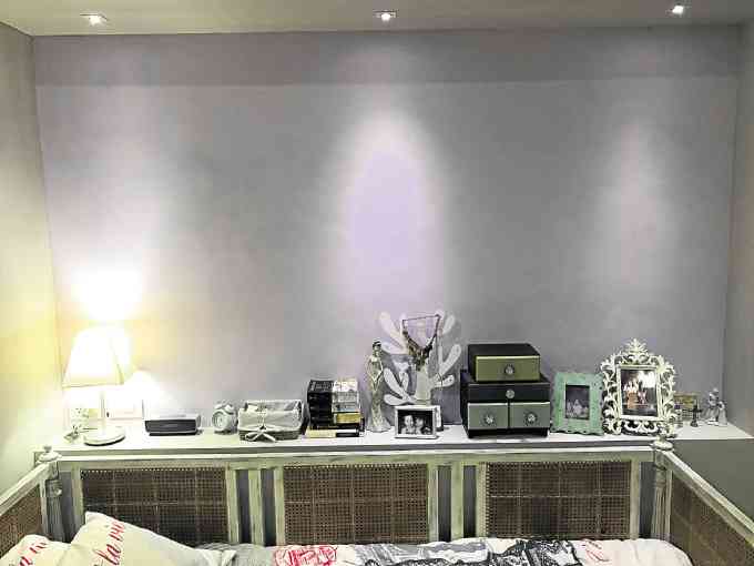
A faint purple for the walls mixed with neutrals such as white and gray.
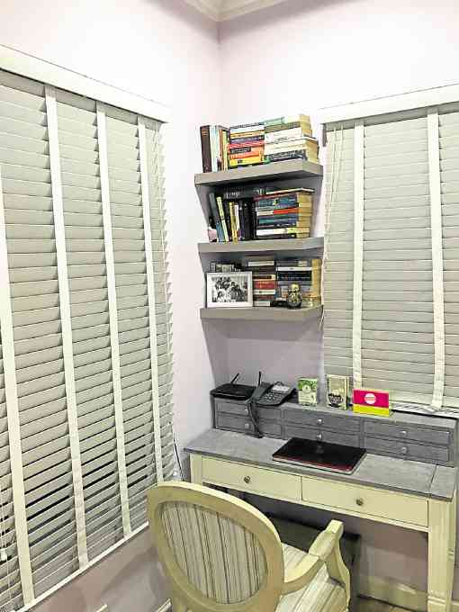
In conceptualizing my room’s design and overall aesthetic, I was inspired by the simplistic and minimalist spaces I was fortunate enough to see during my studies in Europe.
I noticed that homes and apartments there were mostly decorated with neutral color palettes, and were furnished with contemporary pieces with clean lines.
It was important to me that even with the simplicity of the room and its decor, bits and pieces of my personality still showed. I chose a faint purple for my walls since it is my favorite color but mixed it with neutrals such as white and gray.
Mementos and snapshots from my various travels also gave life and character to the space. I hung a travel board where I can post polaroids and my collection of keychains from all the cities I have visited.
In designing, I also greatly valued functionality. I made sure to maximize the space by adding ample storage areas for bags, shoes, clothes and make up—without sacrificing design and the overall look.
Neutral palettes can look great and classy.
Tips
- Neutral palettes are timeless
Some people shy away from basic and nude colors such as whites and grays.
They prefer to add bold pops of color. However neutral palettes can look great and classy too. These colors definitely do not go out of style and can still look chic, even after many years.
- Make decorations personal
Your decor need not to be store bought. Use what you have such as memorable photos or pieces from a personal collection to add life and character to your room. They can also remind you of your best memories after a grueling day.
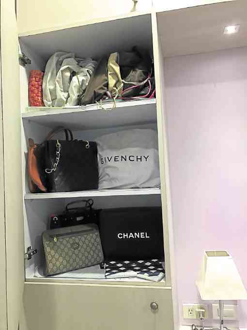
Maximize space by adding ample storage areas for bags, shoes, clothes and make up
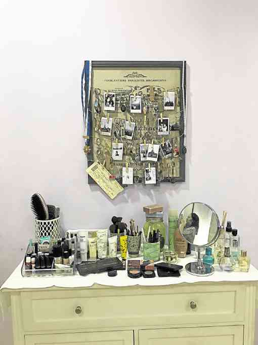
Mementos, snapshots from various travels