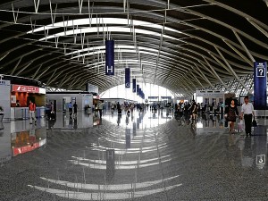
TERMINAL 2 of the Shanghai Pudong International airport: spacious and bright, with large halls and generous openings that allow natural light to flow in
There is news that the Naia Terminal 1 will be undergoing some renovation. Finally! But the big question popped into my mind: how much of an improvement will there be? As an international traveler’s first stop, the experience of going through this terminal is a terrible introduction to our beautiful country and what it has to offer.
An airport will always be a gateway. It is the first thing travelers experience upon arriving at a new destination. Like it or not, the first whiff of “local” air, the experience during the short traversal between aircraft and exit, and everything that transpires during this short indoor journey, all play upon our senses in creating a memory that will stay in a visitor’s mind close to forever. Our existing Naia Terminal 1 has little to offer when compared to even just our neighbors in the region. Its makeover time is glaringly overdue.
My wish list
What to see in a refurbished Terminal 1? This is my wish list:
That sense of space. Terminal 1 has already exceeded its maximum capacity, so I am trying to figure out how the refurbished terminal will deal with this given that its floor area has reached its limit. Major replanning will have to be considered. Terminal 2 is starting to feel a bit too crowded as well.
Natural light. Except for its hallways leading to the boarding gates which are mostly flanked by windows on both sides, and the boarding gate waiting areas that have nearly floor to ceiling windows, all other areas of Terminal 1 are nearly devoid of natural light. The departure hall alone, with its dark timber ceilings and walls, looks not only sad and tired, but dingy as well. The window areas are not enough to bring in light. Roof and floor slabs should be punctured to introduce light wells, skylights or clerestory windows. The interior finishes can also be studied, kept to a light palette, in order to harness the natural sunlight.
Larger restrooms and cubicle. I find it appalling that none of our terminals have traveler-friendly restroom facilities. Terminal 1’s restrooms are the worst—tiny, like a back-of-house toilet for staff rather than a toilet for guests. The cubicles are tight, and the restroom itself is small, badly lit, and sorely lacking of amenities. Terminal 2 has tiny restrooms as well, with inadequate cubicles, causing long queues that often spill out of the door.
Only the restroom facilities at Terminal 3 come close to ideal, but the space is too deep that getting to an empty cubicle at the end means weaving through others standing by the lavatories. The passageway is not wide enough for passing through with large bags or luggage. The cubicles are not roomy enough for taking in a trolley or hanging a heavy hand-carried bag. Yes, many people travel alone and have no one to leave their belongings with.
Staircases that feel lighter and brighter. Terminal 1 has long and narrow staircases or escalators descending into the boarding gates. These are flanked by walls and solid rails that further emphasize the slenderness of the spaces, making them feel constricted and unfriendly. Perhaps getting rid of the solid concrete rails and replacing them with steel and glass will open them up. Coming from more spacious areas, the staircases feel as if you’ve turned into an alley from a main road. A centralized entry to the lower levels, with a large atrium-like opening leading to all the boarding gates, if at all operationally possible, would be ideal, and would make moving down to the lower level a more enjoyable descent.
Modern and durable wall, floor and ceiling finishes. Painted walls just can’t endure high-traffic areas like terminals; carpet is difficult to maintain in a polluted environment such as ours; noise will always be generated in any place the Pinoys gather, and the volume will be a problem. Let’s get real. The terminal has to be true to the needs of the travelers, the realities of our cultural idiosyncrasies and the physical environment we exist in. Money has to be spent wisely, and on the things that will, on the long term, be so durable that they will deliver many, many years of use and abuse before they start to look weary and tired.
My list is not done, I could go on quite a bit longer, but one other very important wish I need to state here is for the architecture of Terminal 1 to be respected, and the concepts of its original forms be maintained albeit modernized. The terminal has a beautiful timeless form, as it was designed by one of our National Artists, architect Leandro V. Locsin. I hope too that the flavor of this exterior can be brought into the interior so that the experience of terminal from outside to the inside is unbroken.
Despite all its flaws, the Philippines is a beautiful country. How sad that we disenchant our guests upon their first step onto our land. Our country deserves proper representation, most especially right by its doorstep.
Contact the author through designdimensions@abi.ph or through our Asuncion Berenguer Facebook account.

