


UP Fighting Maroons get own distinct logo
The design team grabbed the opportunity to help UP.
It’s nice to see local companies investing in brand identity design.
Restaurants, small and medium scale enterprises and even big brands like Bench, Cebu Pacific and Smart are rolling out new logos to signal a brand refresh.
These large and small companies see the value of building their brands through brand identity and graphic design.
What exactly is a brand?
Seth Godin, best selling author, marketer and entrepreneur, shares his definition: “A brand is the set of expectations, memories, stories and relationships that, taken together, account for a consumer’s decision to choose one product or service over another. If the consumer (whether it’s a business, a buyer, a voter or a donor) doesn’t pay a premium, make a selection or spread the word, then no brand value exists for that consumer.”
While designers are not responsible for creating the brand (that responsibility belongs to the company/organization), we help visually present its values, the essence of its products or services.
Brand identity design, a subset of graphic design, concerns the visual aspects that form part of the overall brand. The logo identifies a business in its most basic form.
A brand identity system includes typefaces, colors, layouts and anything that visually represents the brand and its appropriate use across various applications.
For example, these include how its visual elements should look like on corporate stationery, print ads, or on materials for co-sponsorship events.
Legendary graphic designer Paul Rand, known for his logo designs for UPS, IBM, Westinghouse, and Steve Jacob’s NeXT, writes: “a logo is a flag, a signature, an escutcheon, a street sign. A logo does not sell (directly), it identifies. A logo is rarely a description of a business. A logo derives meaning from the quality of the thing it symbolizes, not the other way around. A logo is less important than the product it signifies; what it represents is more important than what it looks like. The subject matter of a logo can be almost anything.”
A company usually requests for the services of a brand consultant to help develop its brand strategy and create its identity system. These brand strategy and visual identity systems serve as guidelines for advertising and marketing agencies. These agencies then offer tactical advice on how to deliver the brand’s messages and identify the best channels to broadcast them.
It’s quite impossible to ask a designer to create an “iconic” logo, because a logo is never “iconic” in its infancy. It has a chance to be “iconic” when it’s used consistently through time. What designers can do though is create a logo that’s distinct and memorable.
That’s what we aimed to do when we created the brand identity system for the UP Fighting Maroons.
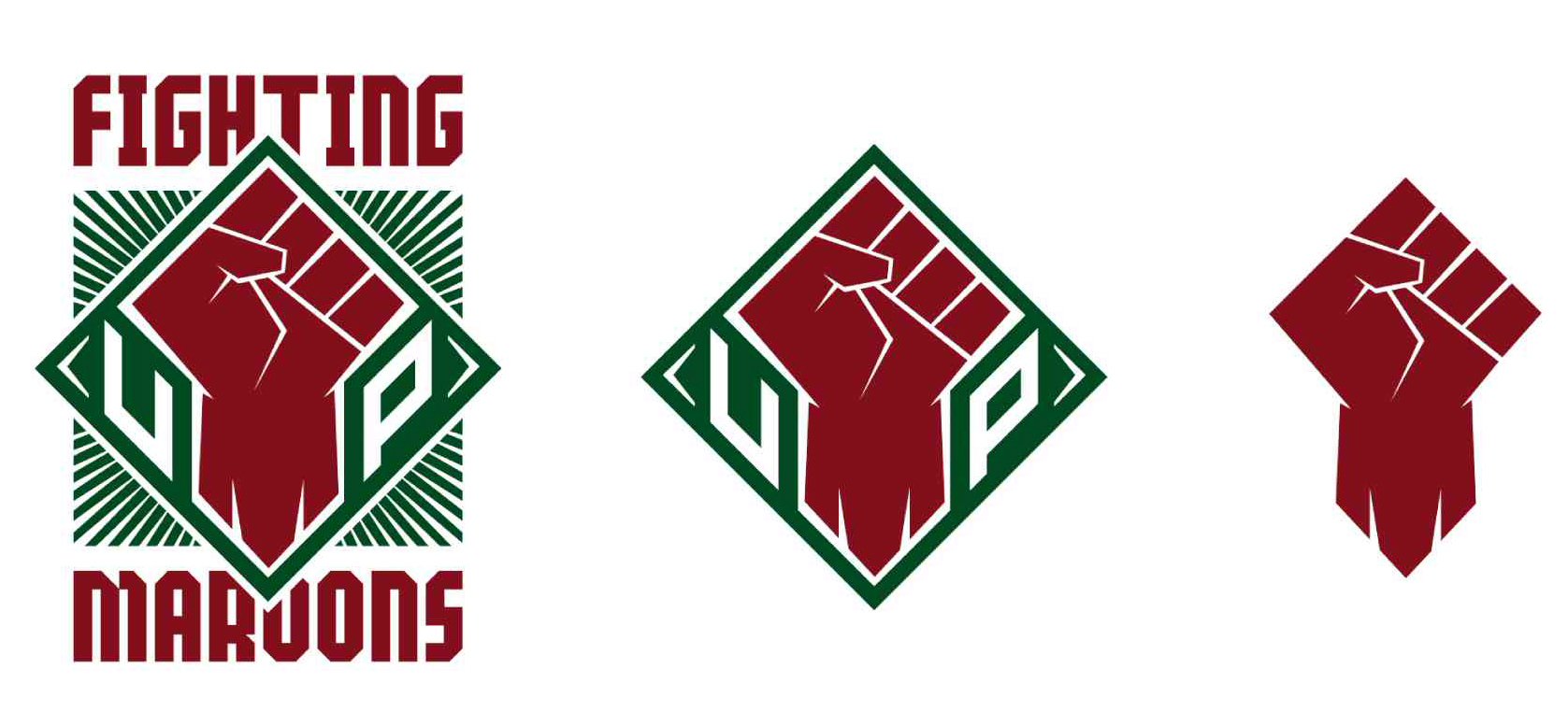
The left fist was used in the logo because UP has always been known as a center for activism.
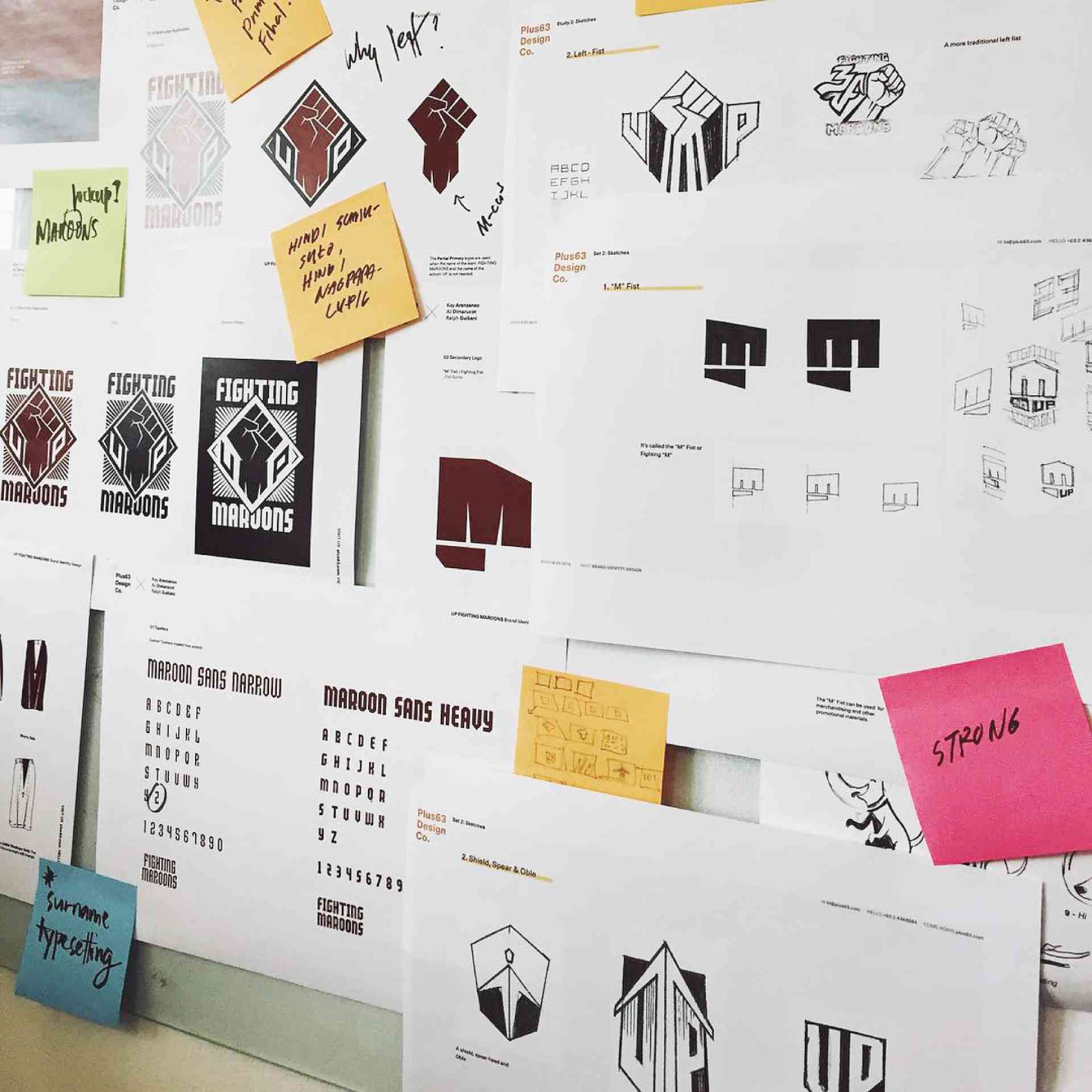
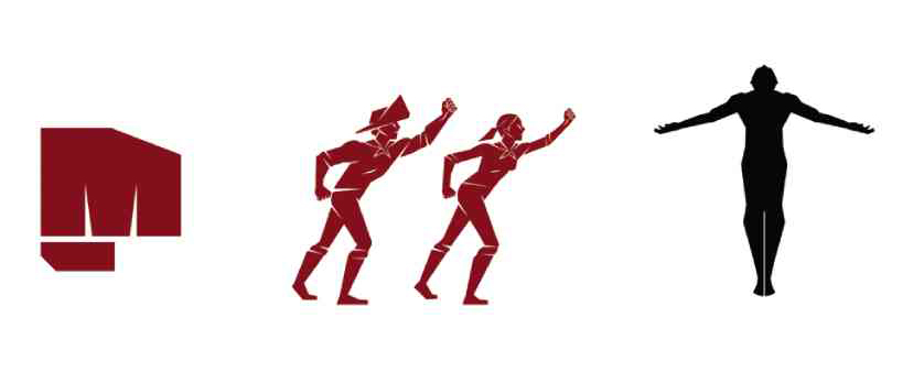
It’s a system because it involves a lot of elements and applications. While the logo is the main mark that people will primarily see, it’s the whole system that makes it dynamic. If you’re familiar with athletic/sports branding, you’ll notice that teams have different iterations of the brand: main/primary logo, partial primary logos, secondary logos, tertiary logos, mascots and so on. It helps extend the brand through merchandising and other commercial applications.
The team that worked on this project included Plus63 Design Co. (me, Bernice De Leon-Yumul, Joanna Malinis and Raxenne Maniquiz) and other designers and creatives among UP alumni who contributed their time and talent, namely AJ Dimarucot, Kay Aranzanso and Ralph Guibani. We also got Dang Sering to help us with the copy.
The team is a good mix of creative people with experience in brand design, sports design, illustration, typography and communication. Mandy Reyes and Pete Jimenez, both advertising and production stalwarts, were there to oversee the entire process.
After the previous logo was prematurely leaked, a group of UP alumni who help the UP athletic teams approached us to work on the project. Even if it was a pro bono project, we immediately said “yes” because it was an opportunity for us to use our talents to help the university. The timeline was also pretty tight (one and a half weeks), because the branding has to be ready a month (or more) before the UAAP opening.
We asked UP for a design brief.
A design brief usually helps designers define the creative direction of the project. It also helps us gather insights from the stakeholders: varsity teams, alumni, members of the academe and administration. Part of the design brief was not to use the Oblation.
We had consultations with the UP Varsity members, the coaches and the office of the Chancellor. Once we got all the necessary information, we started brainstorming and conceptualizing. We thought of different ideas and possible directions; different iterations and sketches. We eventually had to choose a particular direction to pursue. It’s best to focus on one strong concept and create the brand identity system from there.
When the team was brainstorming, we agreed not to use the UP Oblation as part of the logo. For the longest time, the UP Fighting Maroons never had its own distinct mark and icon. This was a good opportunity to create one.
Ateneo has its Blue Eagle, La Salle has the Green Archer, so we thought of symbols that would best represent the “palaban” or fighting nature of The Fighting Maroons. We’ve read the comments and suggestions from students and alumni and thought that the fist is the best representation for UP and the Fighting Maroons.
We used the left fist because UP has always been known as a center for activism. A raised fist is also a rallying call, a call for everyone to congregate and support the Fighting Maroons. We wanted people to immediately think “UP” when they see the logo.
For people looking for the Oblation, “Oble” is still part of the brand identity system. It will be used for applications on team uniforms and other internal usage.
Creating a new brand identity is a sign that an organization wants change. For us in the design team, we hope that the re-design is a gesture that will help move the Fighting Maroons upwards and onwards. It might make some people uncomfortable at first, that’s quite understandable because it’s new, but hopefully, people can get behind it and support the team.
The UP Fighting Maroons need all the support they can get. As designers, this is how me and the whole team want to show our support to the University and the athletic team.
UP Fight!
(The author is the leader of the design team that worked on the brand identity of the UP Fighting Maroons. He is a Visual Communications graduate of the UP College of Fine Arts who has worked on projects for companies such as Google, Nike and The Wall Street Journal.)


